In this guide, I'll walk through the exact process we used to generate cinematic, double-exposure game posters for some of our favorite games with ChatGPT's image generator. One master prompt, four games, four very different moods. By the end of this guide, you'll have the formula, the reasoning behind each line, and four working prompt variations you can drop straight into your own chat.
Pay less for your games.
Get discounts up to 80% off
Before You Start
This works in ChatGPT with image generation enabled (the 4o model). No plugins, no Midjourney, no Stable Diffusion setup. If you can paste a prompt, you can do this.
The whole point of this guide is that you don't need to write a custom prompt for each game. ChatGPT already knows what these games look like and can pull design elements directly. The prompt below is engineered so that the only variable you ever change is the game name. Everything else stays identical (but feel free to experiment & have fun with it).
The Master Prompt
Here it is. We won't keep you scrolling and hunting for the secret sauce, but keep reading if you want to see what some of the results can look like and a few tips and tricks we learned while working on this.
Go ahead and copy it, swap "[GAME NAME]" for any game you want, and paste it into ChatGPT.
Cinematic double exposure poster of [GAME NAME], featuring a large emotional character profile silhouette blended with key environments and iconic scenes from the game.
Layered storytelling composition with a main character in the foreground, supporting characters, and world-building elements seamlessly integrated inside the silhouette.
Highly detailed, atmospheric, soft fog, depth, dramatic lighting, subtle particles, immersive environment design.
Minimalist color palette matching the tone of the game, cinematic mood, painterly and photorealistic blend.
Elegant negative space, premium movie poster aesthetic, centered composition, soft textures, high detail.
Include only the official game logo at the bottom, add any relevant slogan or marketing taglines the game promotion is using in an aesthetic and simplistic way.
Masterpiece, 8k, ultra-detailed, artstation quality.
This is basically what you're here for. Save it somewhere or bookmark this article for later. But now, understanding why it works, and what each line represents is what lets you remix it for posters that suit your style and desired outcome. So let's break it down.
Anatomy of the Prompt: Why Each Line Exists
Line 1, the format declaration. "Cinematic double exposure poster" tells the model the entire visual language up front: silhouette plus scene-inside-silhouette. Without those two words, you'll get a regular character render.
Line 2, the composition rule. This is what separates a poster from a piece of fan art. Foreground hero, supporting cast inside the silhouette, world details bleeding into the edges. It's a hierarchy instruction, not a style one.
Line 3, the atmosphere stack. Fog, depth, dramatic lighting, particles. This is what gives the poster weight. Drop this line and your output looks flat and digital.
Line 4, the color and rendering direction. "Minimalist palette matching the tone of the game" is the line that does the heavy lifting. It forces ChatGPT to look up the game's actual mood and pick a palette to match. That's why GTA VI comes back neon pink and Red Dead 2 comes back blood red and dust. The model is doing the genre-matching for you. "Painterly and photorealistic blend" is the magic phrase that produces that AAA key-art look.
Line 5, the poster grammar. Negative space, centered composition, soft textures. These are the four words that make it look like something a real marketing team approved, not something a Discord prompt-engineer cranked out.
Line 6, the text placement. Logo at the bottom, tagline kept simple. The model will hallucinate fake text everywhere if you don't lock this down. With this line in, ChatGPT pulls the actual game logo and a real or plausible tagline from its training data.
Line 7, the quality stack. "Masterpiece, 8k, ultra-detailed, artstation quality." Yes, it's cliche. Yes, it still works.
Pro tip: If your output looks too AI-rendered or plasticky, add "no 3D render, no CGI sheen, oil painting and film photography texture" to line 4. This forces the model out of its default glossy mode and into something that feels hand-crafted.
The Results: Eight Posters from One Prompt
Here's the proof. Same exact prompt, eight different games, zero changes other than the game name, and we kept the result as is to share the process with you. Notice how the model handles palette, composition, character choice, and tagline differently for each, even though the instructions remain identical with only the name game as the variable.
1. Clair Obscur: Expedition 33
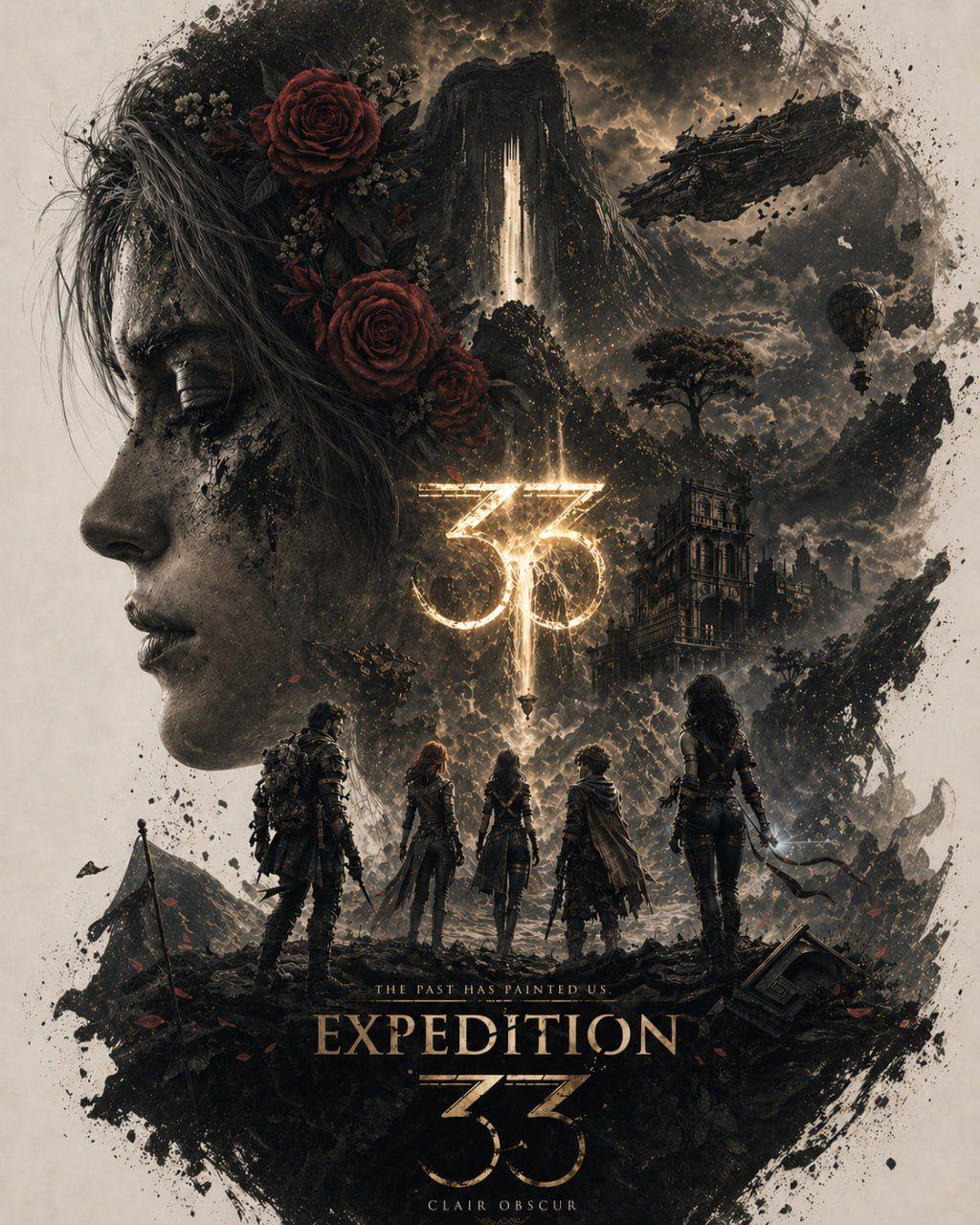
Had to start strong.
What ChatGPT did with the same prompt was pretty cool overall. It pulled a sepia-and-gold palette to match the painterly, melancholic French RPG aesthetic. Female profile of Maelle holds the upper left; red roses in the hair serve as the visual anchor, with a gothic chateau and waterfall inside the silhouette, and the party of five (got 4/5 right on it's own) standing under a glowing "33" sigil. Tagline: "THE PAST HAS PAINTED US."
I'd personally just revise this to include Monoco in the party, but it already looks incredible and maintains the consistency of the background and environment design.
2. Grand Theft Auto VI
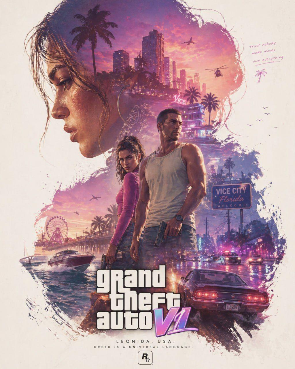
Same prompt, completely different soul for this Grand Theft Auto 6 Poster.
Neon magenta and amber sunset, palm trees, two protagonists center frame, Vice City skyline melting into the silhouette, a vintage muscle car driving away. Even pulled the iconic GTA wordmark with the gradient on the "VI" and added handwritten marginalia ("trust nobody / make moves / own everything") in the negative space. Looks insanely spot on and I was surprised by how good it actually turned out.
3. Crimson Desert
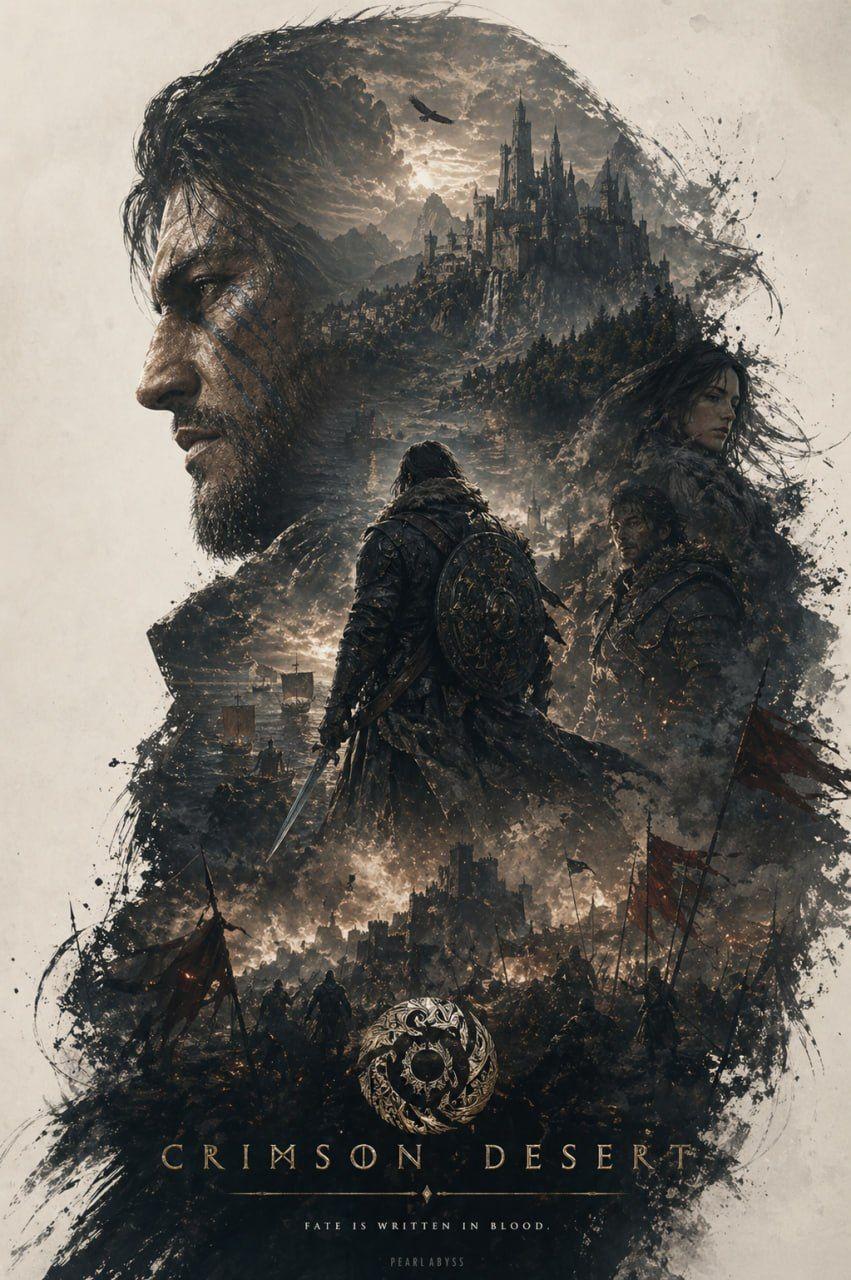
This version has a much more charcoal-and-bone palette, with crimson banners as the single accent. Bearded main character in profile, moonlit cliffside fortress in the upper hairline, hooded warrior with a curved sabre in the center, battlefield of fallen banners across the lower frame. Tagline: “FATE IS WRITTEN IN BLOOD.” and the game studio depicted in the bottom center. Not my favorite of the bunch but surprisingly for a new game with new IP, it did still nail a pretty good design overall.
4. Resident Evil Requiem
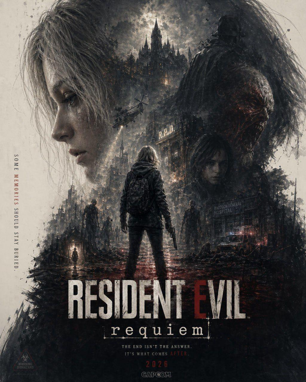
This would've been my favorite if it wasn't missing Leon.
But the RE9 version has a much more cold steel grey and bone white with warning red as the accent. It chose Grace as the female profile, and a tyrant figure as a shadow, lone protagonist with a backpack and pistol in the center, RPD building, helicopter, zombie horde, and a child silhouette in a glowing distant doorway. Two taglines, one running vertically up the left edge ("SOME MEMORIES SHOULD STAY BURIED.") and one beneath the title ("THE END ISN'T THE ANSWER. IT'S WHAT COMES AFTER.").
I found this really surprising considering how unique the overall look and feel of the poster turned out compared to all of the others - feels spot on!
5. Assassin's Creed Black Flag
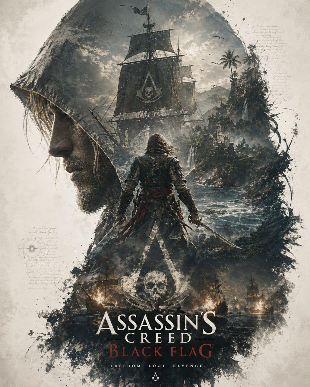
You know I couldn't help it.
With Black Flag Resynced coming out this summer we had to try this one out and we got a storm grey and ocean teal with blood red on the title. Hooded Edward as the main profile, full-rigged galleon with skull-and-bones flag inside the hood, and Edward turned away holding a cutlass, lush Caribbean coastline on the right, burning warships across the bottom, the iconic Assassin's Creed insignia rising from the smoke. It also added a faint handwritten ship's-log notes and a compass rose tucked into the left negative space. Tagline: "FREEDOM. LOOT. REVENGE." I don't know if it's just the excitement over the remaster, but this one's easily my favorite.
6. Assassin's Creed II
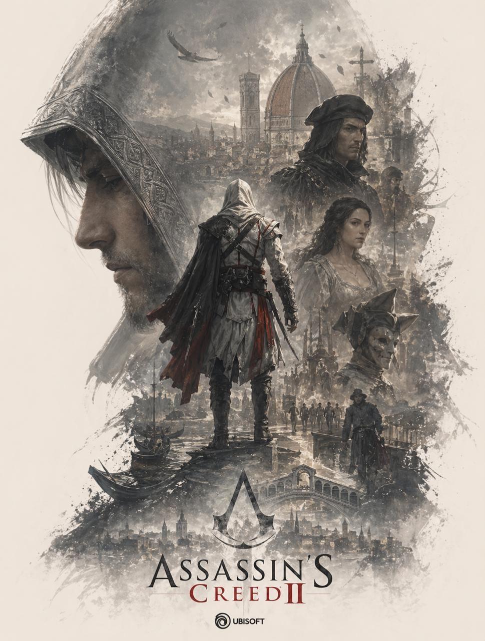
Then we decided to mix it up.
We wanted to see if within the same game franchise, ChatGPT could nail different vibes and looks based on the difference in those games themselves, so we stuck with Assassin's Creed and went for AC: 2 with Ezio as a test. And boy did it deliver.
Sepia and parchment palette with red as the accent on Ezio's sash. His hooded profile with the iconic carved hood detail, Florence Duomo dome and Rialto Bridge inside the silhouette, Ezio standing center holding a hidden blade, supporting characters (Leonardo, Cristina, the Carnevale mask) layered on the right, Venetian gondolas in the lower frame, the Assassin's insignia anchoring the bottom. Notice how the model nailed the Renaissance setting just from the title of the game and the very quick research it did?
Yeah, that's when we realized this could be a ton of fun to play around with.
7. Red Dead Redemption II
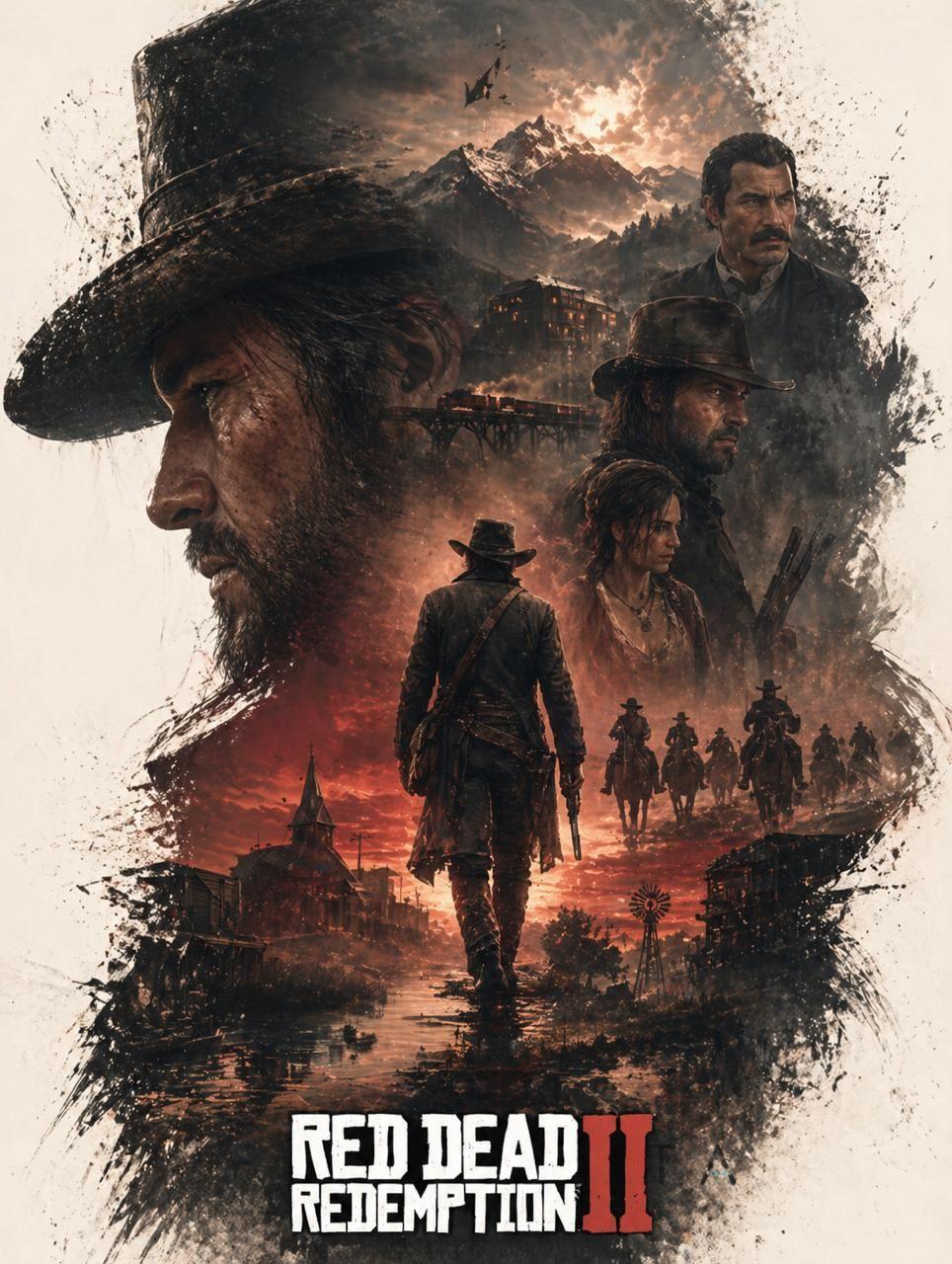
Once again, this one stands out for an entirely different vibe and style overall.
RDR2's poster has a much more charcoal and dust vibe, with a blood-red sunset as the accent. We get Arthur's profile, mountain ridge and steam locomotive on a trestle bridge inside the silhouette, Arthur Morgan walking away from camera in the center, Dutch and the gang layered on the right, posse on horseback charging across the lower frame, frontier town with church steeple and windmill. The Roman numeral "II" gets the same red treatment as the sky - which makes the whole thing look really spot on.
8. God of War
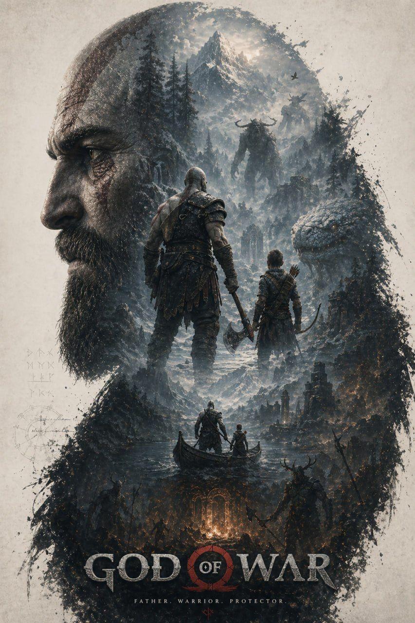
Last, but definitely not least. God of War.
We played around with Kratos across every single game but decided this was the one we wanted to post because of the overall look and feel it nailed.
This time we got a slate grey and rune-etched bone with embered orange as the accent. Older Kratos' profile with the scar over the eye, snow-capped Norse mountains and forest inside the silhouette, Kratos and Atreus standing back-to-camera in the center with the Leviathan Axe, the World Serpent's head on the right, father and son in a longboat in the lower-mid frame, runic glyphs floating in the left negative space. Tagline: "FATHER. WARRIOR. PROTECTOR."
I wasn't a huge fan of the repetition of them both standing on the boat then above as giants among the mountains, but I could kind of see what it was trying to do so I can't hate on it that much either.
Why This Works on Any Game
Look at the eight posters together. Same prompt produced eight completely different designs with:
- Different hero silhouettes and character framing true to each game.
- Palettes ranging from sepia to magenta to ice blue depending on the game.
- Tagline styles from religious solemnity to handwritten marginalia.
The reason it works is that the prompt isn't telling ChatGPT what each game looks like. It's telling ChatGPT how to design a poster. The game knowledge is already in the model and can be surfed on the internet. The prompt is just the brief, exact formula we're using to create this artwork.
That's the unlock. And that's exactly why it's important to read through the structure of it.
The Five Rules That Make This Work
If you want to take the prompt apart and build your own variants for posters outside gaming (movies, books, podcasts, brands), these are the rules to keep.
1. The silhouette is the canvas, not the subject. The hero's profile is just a window. Everything interesting happens inside it.
2. Trust the model on palette. Don't specify colors. The phrase "matching the tone of the game" lets ChatGPT pull the right palette from its training data. That's how you get nine different moods from one prompt.
3. Describe layers in depth order. Foreground, then mid-ground, then background. The model stacks elements in the order you mention them.
4. Lock the text or it will hallucinate. Always include the line about logo placement and tagline. Otherwise you'll get gibberish in fake fonts scattered across the frame.
5. Painterly and photorealistic is the magic phrase. This single combo is what produces the AAA key-art look. Drop either word and you lose it.
Frequently Asked Questions
Do I really only need to swap the game name?
Yes. Every poster in this guide was generated from the exact same prompt with only "[GAME NAME]" replaced. The model handles palette, composition, character selection, and tagline based on its training data on each title.
What ChatGPT model do I need to generate game posters?
You need ChatGPT with image generation enabled, which uses the 4o model. It's available on the Plus, Team, and Enterprise plans, and has limited access on the free tier. No plugins or external tools are required.
Can I use this prompt for any game, not just AAA titles?
Yes, with one caveat. The model is strongest on games it has lots of training data on (anything AAA, indie hits with major coverage, Steam top-100 titles). For very obscure or unreleased games, you might need to add a sentence describing the protagonist, setting, and tone, or just attach a few reference images. Treat the prompt as a brief and feed it more details when the model doesn't know the game.
Why does my poster look like generic AI art?
You're probably missing one of three things: the "painterly and photorealistic blend" line, the "minimalist color palette matching the tone of the game" line, or the "no CGI sheen" instruction (add this if needed). All three are in the master prompt above. Don't strip them out and play around with it until you get a result you like.
How do I stop ChatGPT from generating fake or garbled text on the poster?
Keep line 6 of the prompt intact: "Include only the official game logo at the bottom..." That single line is what stops the model from scattering hallucinated words across the frame.
Can I use these AI-generated game posters commercially?
ChatGPT's image generation terms allow commercial use of outputs you create, but you cannot use copyrighted IP (real game titles, official logos, recognizable characters) commercially without rights. For client work and original IP, this prompt structure is perfect. For posting fan art of existing games, treat it as personal or editorial use only.
Does this work outside of gaming?
Yes. You could also easily swap "[GAME NAME]" for a movie, a book, a podcast, a brand, even a person. The structure is universal. "Cinematic double exposure poster of [The Lord of the Rings]" or "[Joe Rogan]" both produce solid results because the format itself is what's doing the work.
Ready to Build Your Own?
Copy the master prompt. Swap in any game, movie, or brand name. Paste it into ChatGPT. And you're good to go.
If the first output isn't quite right, don't rewrite the prompt. Re-run it. Same prompt, different generation, different result. The variance between runs is part of the system.
If you're an indie dev sitting on a great game but no key-art budget, this prompt is yours (if there's not enough visual design or info about your game online, you can attach a few reference images in the prompt message too). If you're a fan who wants a phone wallpaper of your favorite title that nobody's made yet, this prompt is yours too. Both use cases are why we wrote this, and we hope you have a good time playing around with it.