

Forty years of Mario, and Nintendo is still finding ways to keep the brand feeling fresh. Right as the dust settles on the Super Mario 40th anniversary celebration, the company has quietly refreshed the iconic Super Mario logo on its official website, giving it a noticeably more dimensional, 3D appearance.
You might scroll past it without a second thought. Look closer, though, and the difference is clear: the familiar red wordmark now carries depth and volume that the previous flat version simply did not have. Nintendo updated the logo on the official Super Mario character page, and sharp-eyed fans were quick to flag the change on social media.
A logo with a long history
The Super Mario wordmark has gone through several iterations over the decades, each one reflecting the visual style of its era. Social media posts tracking the logo's evolution show a clear progression from the early pixelated treatments of the 8-bit era through to the cleaner, flatter design that held for much of the last decade. The new version leans into the kind of dimensional style that has become more prominent across Nintendo's marketing materials in recent years, particularly as the Switch 2 era pushes higher-fidelity visuals.
Here's the thing: a logo update this subtle rarely happens in isolation. Branding changes at Nintendo tend to ripple across merchandise, marketing, and digital storefronts over time. What starts as a quiet website tweak often becomes the standard reference point for everything that follows.
Alongside the refreshed logo, Nintendo also appears to have uploaded new, more detailed character renders of Mario himself to the same page. The renders carry noticeably higher detail compared to what was there before, suggesting the company is updating its official asset library post-anniversary.
What the 40th anniversary set in motion
The timing makes sense in context. Nintendo wrapped up the Super Mario 40th anniversary with a substantial run of releases and events, including the Super Mario Galaxy Movie, the Super Mario Galaxy 1 + 2 compilation, new amiibo, Mario Tennis Fever, DLC for Super Mario Bros. Wonder, and Yoshi and the Mysterious Book. Super Mario Sunshine also landed in the Nintendo Classics GameCube library during the celebration window.
That kind of sustained push tends to leave a brand refresh in its wake. The 40th anniversary gave Nintendo a natural moment to reassess how the series presents itself visually, and the logo update looks like the clean-up act after a big party.
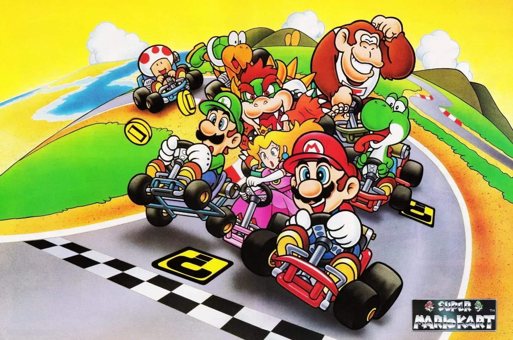
Fans of the series going all the way back to Super Mario Kart on the SNES will recognize just how much the franchise's visual identity has shifted since those early days. The original game's chunky, sprite-based aesthetic was a product of its hardware, but the logo sitting on Nintendo's website today is clearly built for a world of 4K displays and high-resolution storefronts.
Small change, bigger signal
Brand refreshes at this scale rarely come with press releases. Nintendo tends to let these things surface organically, which is exactly what happened here. The key here is that this is not a reinvention of the logo, it is an evolution. The core identity stays intact while the execution gets modernized.
What most players miss is that logo updates like this often precede broader marketing pushes. With the Switch 2 now the primary platform and a new generation of players discovering Mario for the first time, having a sharper, more contemporary visual identity in place is practical housekeeping as much as anything else.
If you want to brush up on the franchise's history while the brand steps into its next chapter, the Super Mario Kart guides collection is a solid starting point for the series that helped cement Mario's racing legacy. For broader Nintendo gaming content, the full gaming guides hub has you covered as the Switch 2 era continues to build momentum.