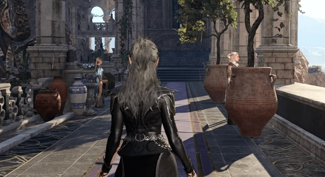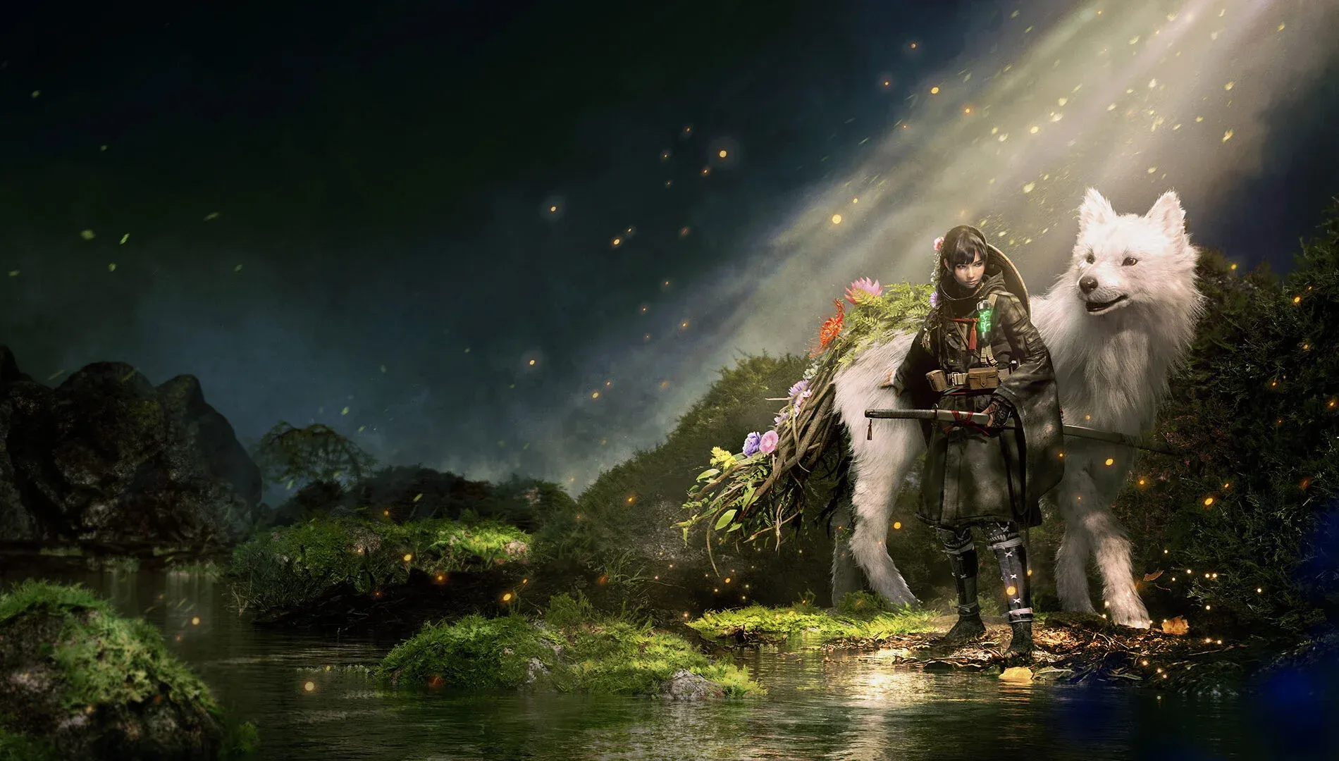


Game Freak director Kota Furushima has openly acknowledged that Beast of Reincarnation looks nothing like a typical Game Freak game, and he was the first person to notice. In a translated interview, Furushima said his immediate reaction when seeing the game's photorealistic visuals was blunt: “The first thing I thought was 'this doesn't really fit our vibe does it?' This isn't a photorealistic graphics kind of studio.”
That kind of candor from a director about their own project is rare, and it tells you something about how deliberately this visual direction was chosen rather than stumbled into.
Use code TRYHARD33 at checkout to redeem this offer before code expires again.
Get 33% Off GAMES+ Subscription
Why photorealism made sense for this particular game
Furushima's reasoning comes down to what the game's concept demanded. While building the prototype, he said he "began to realize that photorealism would be the best fit for what I'm trying to express here." The themes he was working with, he explained, aren't actually that far removed from what Game Freak has explored before. The studio's history of building emotional bonds between players and creature companions carries directly into Beast of Reincarnation, even if the visual wrapper looks completely different.
Here's the thing: Game Freak has always been more defined by its design philosophy than by any single art style. Look at the studio's back catalogue outside Pokemon. Drill Dozer, Tembo the Badass Elephant, Little Town Hero, all colorful and approachable, but none of them photorealistic. Beast of Reincarnation is the first time the studio has pushed into territory where, as Furushima puts it, "it's difficult to tell the country it's made in." That ambiguity is intentional. He sees it as a marker of the game being unmistakably "made by Game Freak" in terms of its ideas, even when the visuals don't carry the studio's usual fingerprint.
The gap between studio identity and creative ambition
What makes this admission interesting is what it reveals about how studios get typecast. Game Freak built 30 years of brand equity on stylized, accessible visuals. Pokemon's art direction is so deeply associated with the studio that anything departing from that palette reads as jarring, even to the people making it.
Furushima isn't apologizing for that gap. He's acknowledging it exists and explaining why he crossed it anyway. The prototype convinced him. The concept required it. That's a straightforward creative decision, but it takes confidence to make when your studio's entire visual identity points the other direction.
For players who've spent time with Pokemon Pokopia, the contrast is stark. Pokopia leans into the franchise's signature warmth and color, right down to mechanics like the photo ops system that reward players for capturing the world's charm. Beast of Reincarnation is operating in a completely different register.
What this means for players watching the game
Furushima's comments confirm that the photorealistic direction wasn't a publisher mandate or a trend-chasing decision. It came from the prototype itself telling him what it needed. That's a meaningful distinction for anyone trying to read whether this project has genuine creative conviction behind it.
The key here is that Game Freak isn't abandoning its identity. The studio's signature focus on companionship and emotional partnership with creature-like characters is present in Beast of Reincarnation. The visual language is just new territory. Furushima's self-awareness about the disconnect suggests the team went in with clear eyes rather than stumbling into an art style that doesn't suit them.
For Pokemon fans curious about what else Game Freak is capable of, Beast of Reincarnation is shaping up to be the most direct answer yet. If you want to stay across everything in the Pokemon universe while that answer develops, the Gimmighoul trading guide and the rest of our gaming guides will keep you covered on the franchise's current releases in the meantime.