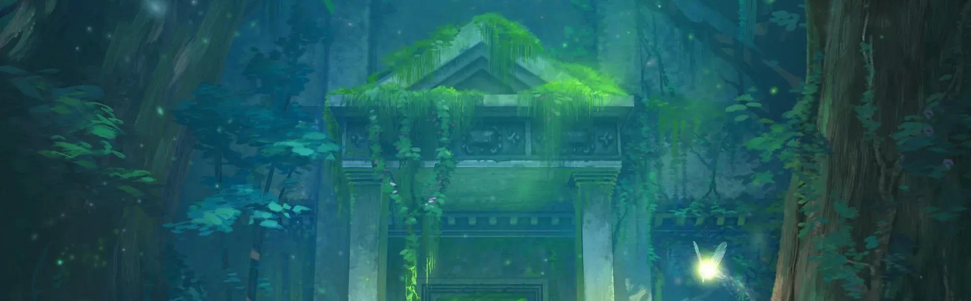

Nintendo's Zelda series producer Eiji Aonuma called it a "faithful interpretation" of the original. After more than an hour of hands-on time with the remake, that phrase does a lot of heavy lifting. The Legend of Zelda: Ocarina of Time remake is not a 1:1 recreation of the Nintendo 64 classic. Puzzles have been redesigned, dialogue has been expanded, and the entire game carries a theatrical design philosophy that changes how you read every room, every enemy encounter, and every loading screen.
The visual leap is immediately apparent
Stepping into Kokiri Forest on Nintendo Switch 2, the first thing that hits you is how alive the world looks. Rays of light filter through the canopy, moss and mushrooms cling to tree bark, and Link's tunic features handwoven stitching visible up close. The whole thing runs at a locked 60 fps. The original MIDI soundtrack has been recreated with what sounds like a small ensemble of live musicians, giving the forest an intimate, almost chamber-music quality.
This is not the kind of visual upgrade you get from a resolution bump. Every area feels purpose-built for this hardware.
Puzzles have been redesigned, not just redecorated
The Kokiri Sword room is the clearest early example of how deep the changes go. On N64, the challenge was navigating a maze with a rolling boulder, teaching players how to use the Z button to recenter the camera in one of the first 3D action-adventure games ever made. That lesson is irrelevant now that the right stick handles camera control freely.
In the remake, the treasure chest sits on a raised platform in the center of the room. Reaching it requires a jump, making it the first moment the game demands you press the jump button. The obsolete tutorial has been stripped out and replaced with one that actually teaches a mechanic you will use throughout the game. That kind of surgical redesign shows up repeatedly across the preview sections.
The world is being rebuilt with internal logic
One of the most interesting design threads running through the remake is its commitment to making Hyrule feel like a place that actually makes sense. A floating platform in Inside the Great Deku Tree, which always looked like it existed purely for gameplay reasons, has been replaced by a crumbling bridge that is physically built into the environment.
The Stalfos arena in the Forest Temple is another example. The original had a hole in the floor that the skeleton enemies could hover over while Link could not, which always looked visually odd. The remake replaces it with a shallow pool of acid. The Stalfos can still walk through it (no flesh to lose), Link takes damage if he enters it, and the fight plays out identically in terms of spatial logic. When two Stalfos spawn as reinforcements, they now rise from the acid rather than arriving with a platform that conveniently fills the room. The fight is harder and the world makes more sense.
Combat feels sharp and theatrical
Link controls like a natural extension of Breath of the Wild and Tears of the Kingdom, with a dash, a jump, and gyro-assisted aiming for ranged weapons like the slingshot. Locking onto an enemy narrows the scene lighting, putting a dramatic spotlight on the encounter while other enemies wait in the background. It plays out like a stage duel.
Sword strikes land with a satisfying impact, enemy attacks clang off Link's shield and knock him back, and the spin attack sends Stalfos exploding into bones. The choreography is clean. Floormasters, the disembodied hand enemies, are now telegraphed by a spotlight that shines on Link and shifts color before the hand drops. Every combat cue feels intentional.
Expanded dialogue adds texture to Hyrule's people
The N64 game had minimal NPC dialogue by modern standards. The remake leans into expanding it. A Castle Town citizen reacts to Link's Kokiri outfit with genuine curiosity, commenting on the handmade stitching. The forest shopkeeper explains why his shelves are empty, blaming Mido for blocking the path to the Great Deku Tree and cutting off the supply route.
These additions do not change the story. They make Hyrule feel inhabited. Characters have opinions, routines, and reasons for being where they are.
The whole game is framed as a theatrical retelling
This is the most unexpected takeaway from the preview. The design philosophy running through the remake appears to draw directly from live theater. Quest logs are written in past tense, as if recounting an old legend. The reveal trailer opened with a narrator reflecting on ancient history. Loading screens between areas, which Nintendo chose to keep rather than remove, now read differently: Kokiri Forest, Hyrule Field, and Castle Town are separate sets, and the transitions are the crew swapping them out between scenes.
The original developers visited Toei Kyoto Studio Park during N64 development, watching samurai stage shows to figure out how lock-on combat should work in 3D. That theatrical DNA is still present, and the remake seems fully aware of it. Hyrule Field may feel smaller than memory suggests, but the game reframes that smallness as a stage representation of a much larger world, the same way a yellow brick road on stage implies a journey far longer than the set physically allows.
What this means for players is a remake that rewards close attention. The changes are not cosmetic, and the design choices are not arbitrary. The Ocarina of Time remake is building toward something specific, and the full picture will only become clear once the whole game is in hand. For everything you need when it releases, the Ocarina of Time guide collection will have you covered.